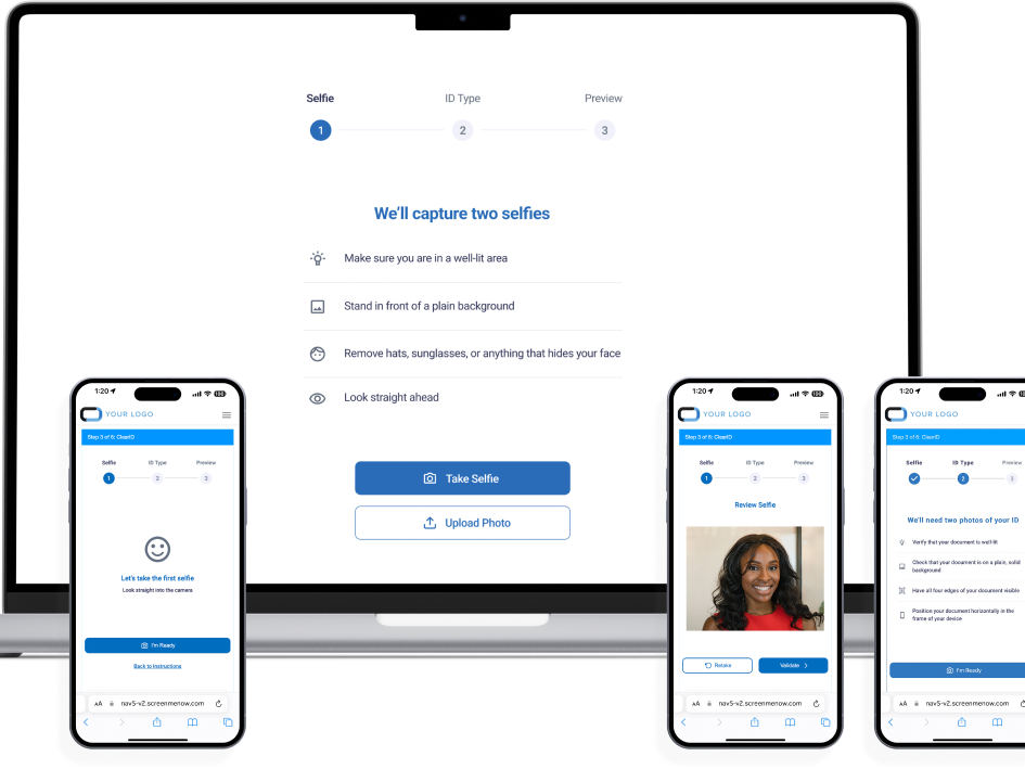
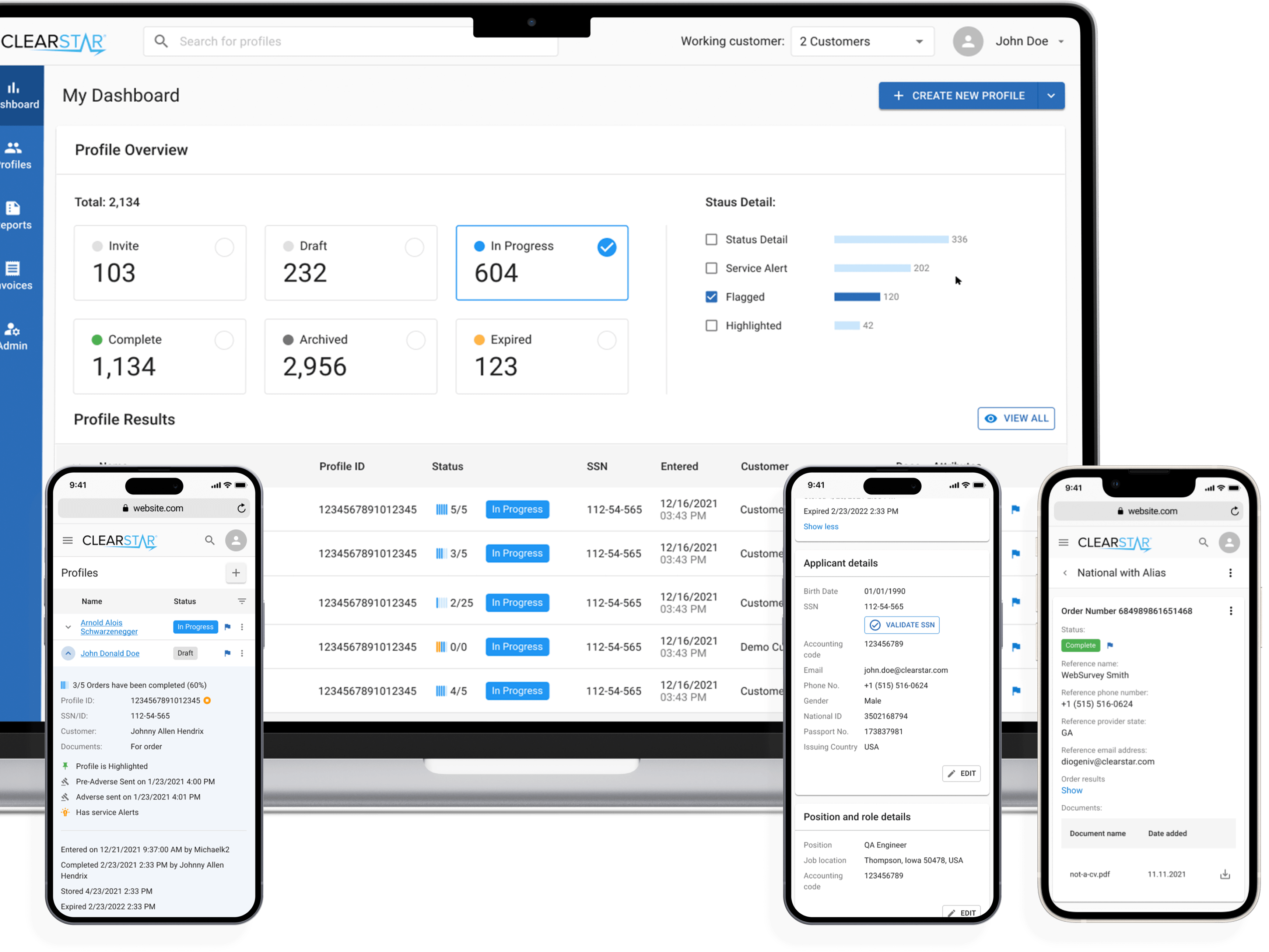
Challenge:
First, break down the flagship platform and assess its content and ease of use.
Then, create the interface and resolve the UX issues.
We conducted a thorough analysis of the flagship platform by breaking it down into its components. This helped us to identify the platform's strengths and weaknesses. We then performed a detailed audit of the content and ease of use to identify areas that require improvement. By understanding the platform's strengths and weaknesses, we were able to design an approach that addresses the user experience's pain points. Finally, we designed the interface with a focus on removing any obstacles to the user experience and ensuring that the platform is as easy to use as possible.
Considerations:
This product has become quite popular thanks to its proven results, which have been experienced by over 2 million users. However, the product has been updated gradually, and its organization requires significant improvement. Unfortunately, there is no available quantitative data regarding the current usage of the product. However, qualitative data can be accessed through feedback and conversations received via support channels.
Complete Content Audit, Task Analysis, & Journey Mapping
We utilized different techniques to determine the situations that our users may encounter, taking into account their motivations and objectives. This helped us arrange the content in a Matrix structure that we developed to be adaptable for future updates and additions. We established a flexible approach to suit users who navigate through content-based and topic-based scenarios. Moreover, we mapped out each scenario's journey to define expectations for the product's behavior.
Solution:
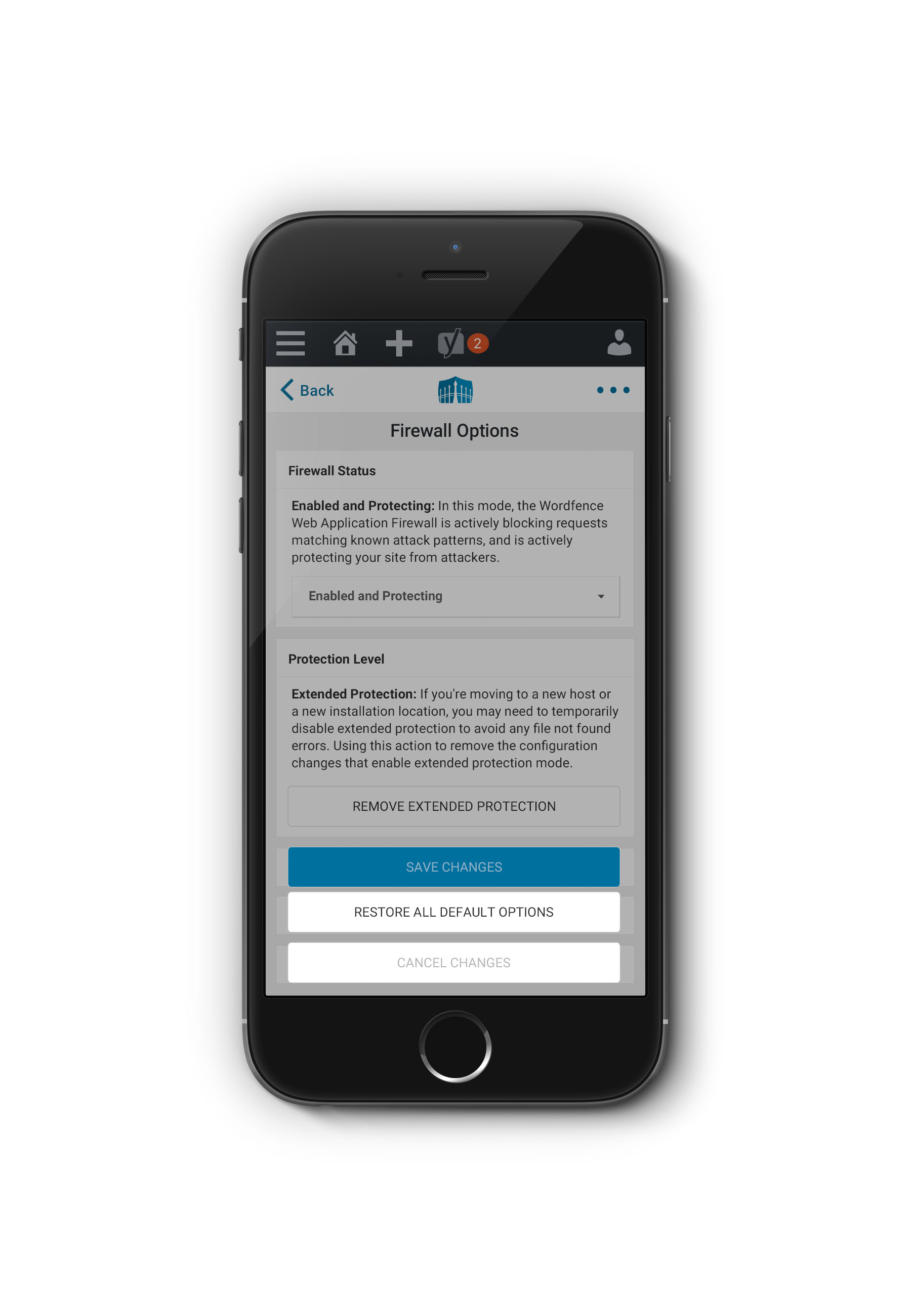
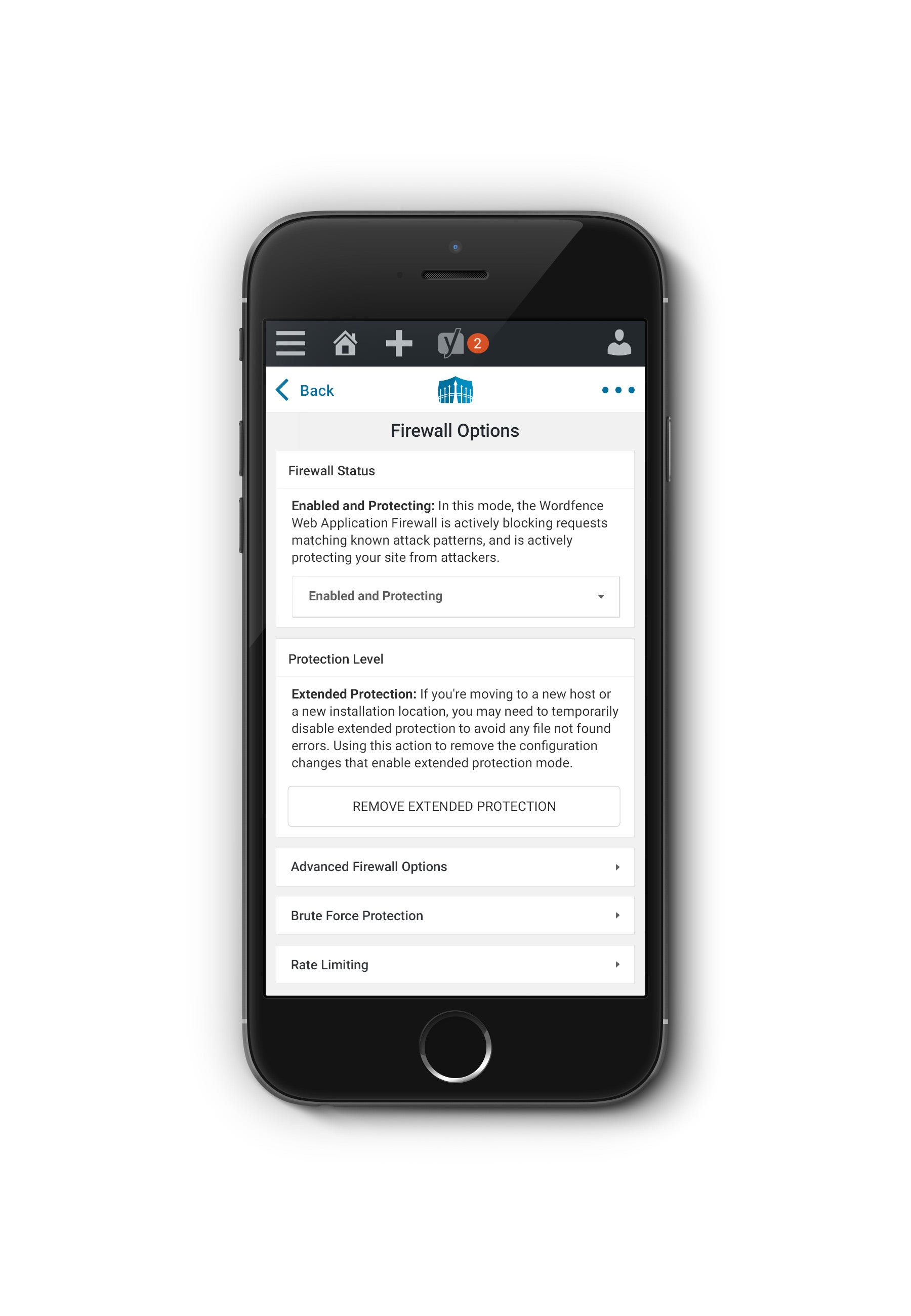
We have simplified the navigation of our plugin by using a drill-down approach that is based on progressive disclosure. This adaptation allows us to cater to the needs of beginner, advanced, and expert users by providing them with what they need, the ability to dig in, and the ability to fully customize the options respectively. We have dissected the existing options page and organized its contents through task analysis, resulting in more meaningful relationships between the options of the plugin.
We have significantly improved the user interface by introducing persuasive design patterns. Additionally, we have added an onboarding process to guide new users through the product and provide them with a better experience. We have also provided informational context through several levels of UI solutions and maintained a strong emphasis on the contextual Premium Value (paid version) throughout the user experience.
As of 2017, the product had almost one million active installs — we released the new version in early 2018, and during the first year, active installs increased to over 3 million.
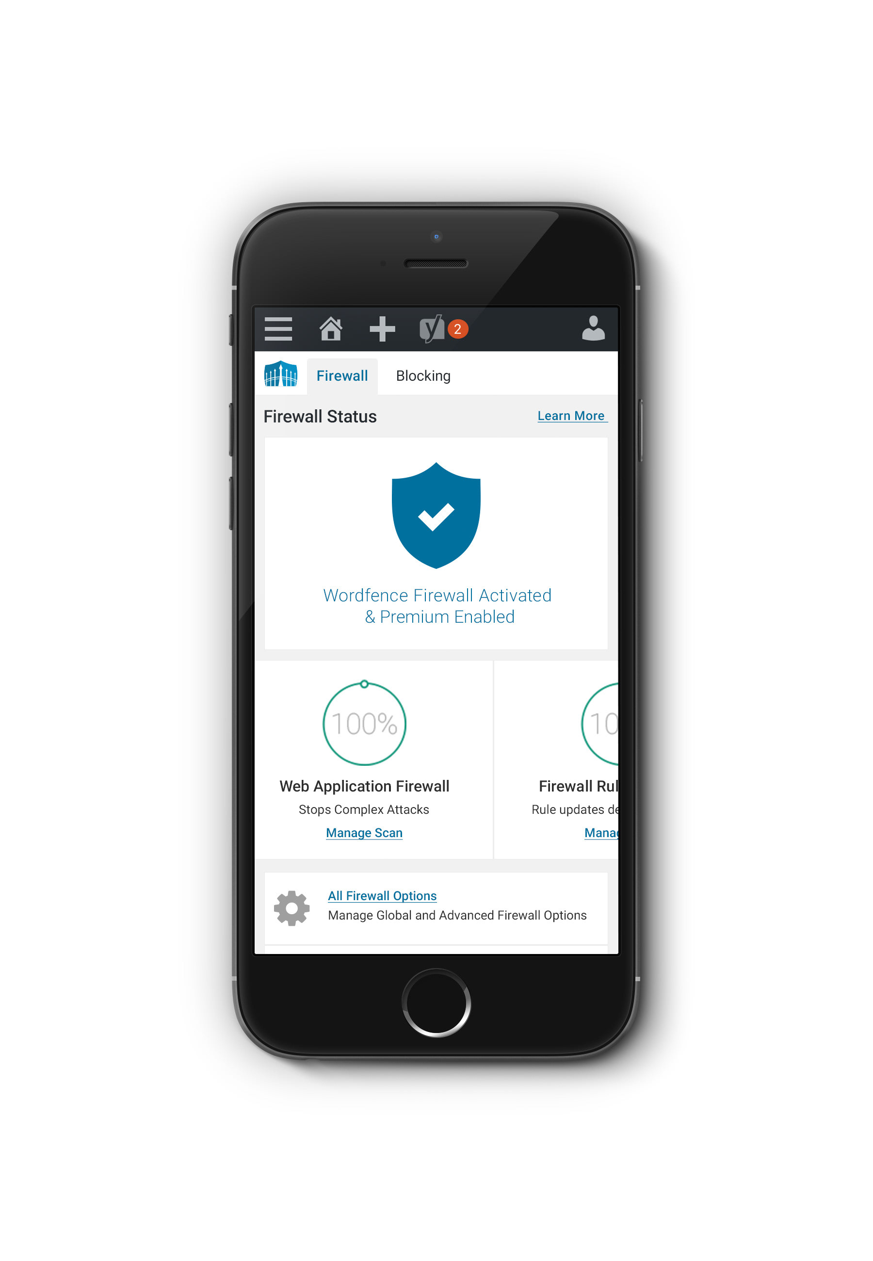
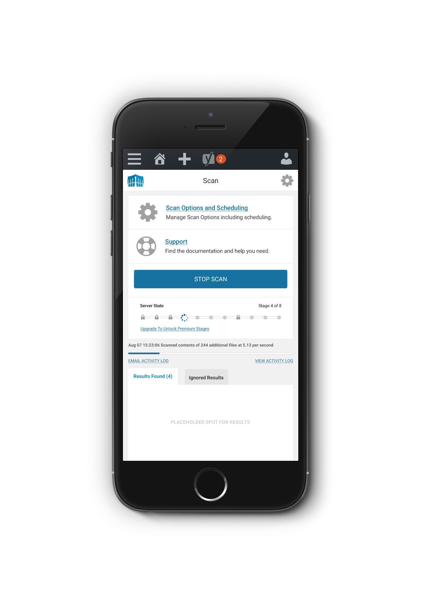


As of 2024 - Wordfence has over 5+ million active installs and an impressive 4.7 out of 5-star rating.
